solution
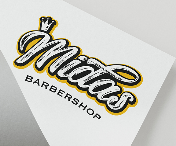
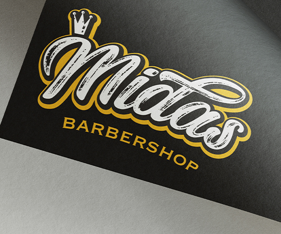
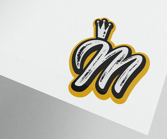
King Midas, who’s touch turned everything to gold, was the key inspiration in the creation of this brand and therefore, we delved into off black and varying gold colour schemes. Key to this branding solution was creating distinct contrast to embolden the Logos impact. Many traditional barber shop window designs are created by freehand painting, we wanted to emulate this tradition by creating a loose calligraphic typeface. It was also important to us to mimic the brush strokes within the logo, to convey this rustic style to both the digital and print space. The logo was finished with a capitalised coppergate font, following the subtle arc of the Midas logo above it to both balance the output & endorse that edgier branding style typically associated with barbershops. The last aspect was to crown the ‘M’, and we present, Midas – the golden touch barbershop. Albeit a small part of the logo, it has some very positive connotations and makes for great reference to Kind Midas.